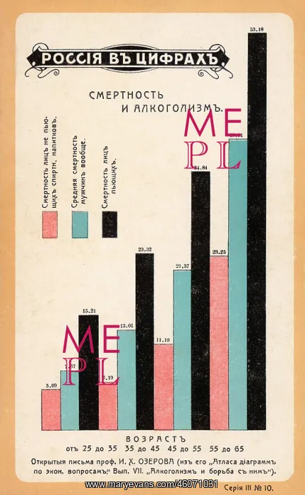
Statistics on death relating to alcoholism
Statistics in the form of a bar chart, showing a comparison of deaths at various ages from 25 to 65, based on an economic atlas published by Professor I Kh Ozerov. Pink represents non-drinkers, blue represents the average figure, and black represents heavy drinkers
Picture No
10289767
Media ID
46071031
Size
3021px x 4892px
(2.4MB)
Credit
Mary Evans / John Massey Stewart Collection
Source
Russian postcard, Moscow
Date
early 20th century
Pick your License
Alcoholism Atlas Average Comparison Deaths Drinkers Mortality Ozerov Statistics Teetotal
Features In These Collections
> Contributors > JMS